
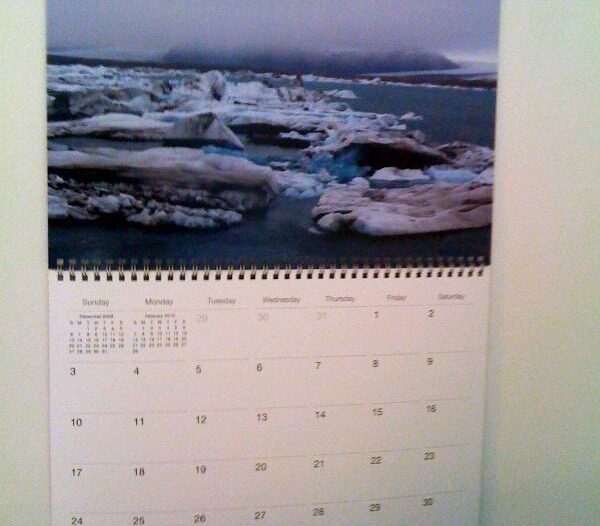
My 2010 calendar, made in iPhoto with photos from my trips over the years, showed up about a week ago.
It looks great. Most of the photos came out very sharp and colorful.
My only comments are:
1. I’m glad I manually lightened and color-adjusted all the images. They would have been too dark otherwise.
2. I removed the text from the calendar cover but there’s a think vertical gray line that isn’t attractive. Luckily I won’t be seeing the cover too often.
3. The one photo that iPhoto warned me was too low-res came out okay. It does look slightly pixellated but it’s not terrible. These calendars do print BIG so you really do need to have very high-res images; the standard jpgs that most cameras shoot as a default may not cut it.
4. I liked the design I chose: I believe it was the Modern Lines theme.
5. I chose to make the images full bleed but next time I would like to try a white border around each image, and a caption below.
Here are a few (bad) photos of the finished calendar. Can’t wait to start using it!


