
Mac OS X 10.7 Lion came out this week.
John Siracusa has written an incredible and very extensive review of Lion on Ars Technica.
In 19 pages (yes!) he goes over fundamentals, security, the file system, applications, and “grab bag.” His conclusion:
“Over the past decade, better technology has simply reduced the number of things that we need to care about. Lion is better technology. It marks the point where Mac OS X releases stop being defined by what’s been added. From now on, Mac OS X should be judged by what’s been removed.”
If you are interested in the minute details of Lion I highly recommend you read (or at least skim) the entire article. Read the image captions for a laugh or two. Even the comments are thoughtful (a true rarity).
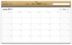
One of my favorite parts of the review is the discussion of interface design, starting on page 5. The new iCal in Lion looks like a leather and paper desk calendar, complete with stitching. Not only is this completely different from most everything else in Lion, but it doesn’t even function the way you envision it should–you can’t tear off sheets, or flip to a future month. As Siracusa writes:
“The trouble is, the new iCal looks so much like a familiar physical object that it’s easy to start expecting it to behave like one as well. For example, iCal tries very hard to sell the tear-off paper calendar illusion, with the stitched binding, the tiny remains of already-removed sheets, and even a page curl animation when advancing through the months. But can you grab the corner of a page with your mouse and tear it off? Nope, you have to use the arrow buttons or a keyboard command, just like in the previous version of iCal. Can you scribble in the margins? Can you cross off days with a pen? Can you riffle through the pages? No, no, and no.”
Or to quote one of Siracusa’s image captions, “These graphics are writing checks this interface can’t cash.”
The iCal and Address Book in Lion are both examples of what he calls skeuomorphic design, “an element of design or structure that serves little or no purpose in the artifact fashioned from the new material but was essential to the object made from the original material.” (from Wikipedia as per the Ars Technica article)
These designs are very similar to the calendar and contacts apps in iOS–take a look at the iPad. On the iPad the imitation old-style calendar and book of contacts were cutesy yet stupid. The idea of actually incorporating those same designs into Lion, especially when the rest of the operating system has a monochromatic gray look, seems like a supremely poor decision, made by someone at Apple who found this little visual joke to be much more clever than it actually is (especially once you’ve seen it for the thousandth time).